Test Insights
The Test Insights page provides, for each test you run on TestingBot, a scatter-plot visualization.
This is a great way to visualize how your test is doing with regards to performance and flakiness over time.
You'll get a visual overview of how the test has been running the previous weeks and months.
Discover trends and outliers and find out how robust your test has run over time.
The only prerequisite is that you've annotated your webdriver sessions with the same name.
Only then can we track how your test has been performing over time.
Viewing Test Insights for a test
In our member dashboard, navigate to the test details page of a test session.
Click the test name on the test details page to open the Test Insights page for this test.
Important: Only tests that have a name (and not unnamed test...) will show this option.
Reading the Scatter Plot Visualization
On this page you'll find a scatter plot with some additional metrics on top of the graph.
Performance metrics include:
- Total Runs: how many times you've run this test in the past.
- Total Failures: how many times in the past did this test fail.
- Fastest Runtime: how many seconds did the fastest run of this test take in the past.
- Slowest Runtime: how many seconds was the slowest execution of this test in the past.
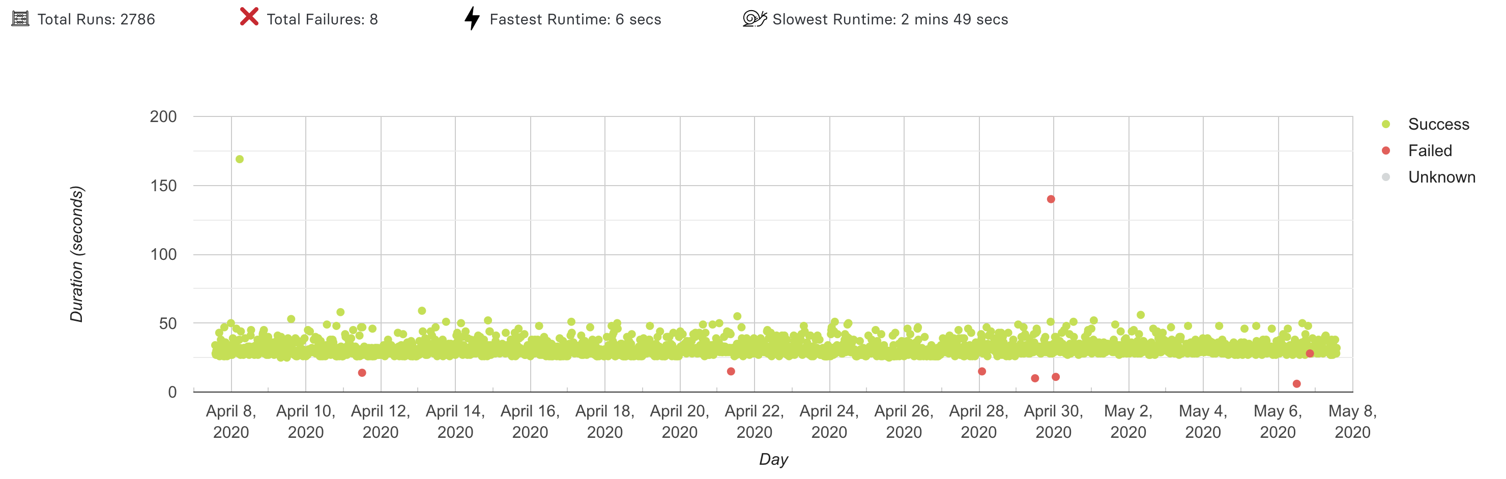
The example graph above shows what to expect from the Test Insights page.
This is a scatter plot, where each dot represents a session with the identical name.
The X-axis indicates a time range (which you can specify in the filter below the graph).
The Y-axis indicates the duration (in seconds) of each test.
The color of the dot indicates if the test passed (green), failed (red) or unknown (gray).
TestingBot does not know your test status by default, you need to annotate your tests with a success parameter.
Interpreting results
You can pan the graph to zoom in or out, and use the filter below the graph to change the time range.
Clicking a dot will navigate to the test details page of that test session.
The example above shows a very consistent graph, with a high pass rate and a couple of (failed) outliers.
Other graphs may show a different story. For example, a flaky test will show a scatter plot with failures on first run and passes on re-runs.